


What others say
Description
DISTANCE LEARNING COMPATIBLE!
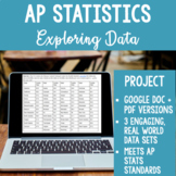
Use this interdisciplinary project, featuring three sets of real world data on a range of topics, to teach your AP Statistics students how to analyze and represent data. This project addresses AP Statistics units 1 and 2: exploring one-variable and two-variable data. It asks students to create, describe and compare the following data displays:
- Histogram
- Cumulative relative frequency plot
- Comparative dot plot
- Scatterplot
- Segmented bar chart
Two versions! Assign the Google doc to your students, and they can type their answers directly into the boxes and submit their work digitally. Assign the PDF version digitally for use with apps like Kami. Perfect for #distancelearning!
Prefer paper and pencil? Print out the PDF and use as a traditional, in person assignment.
This packet includes the following:
- Google doc and PDF
- Space to create the following data displays: Histogram, Cumulative relative frequency plot, Comparative dot plot, Scatterplot, Segmented bar chart
- Three data sets with accompanying tasks (1 bivariate, 2 univariate)
- Complete answer key
- Detailed teacher guidance
- Sample student instructions for jigsaw and stations
Why I Created This Project
1. To expose my students to a wide variety of real-world data sets that they have not seen before, and that address a diverse range of topics. The first data set deals with birth rate data by state, and targets students interested in demographics, health, and social issues. The second data set lists each president by rank and experience, appealing to students with an interest in history and politics. The final data set lists AP Statistics exam questions by topic, and should be of interest to every AP Statistics student preparing for that exam.
2. To give my students the opportunity to create and analyze five data displays,
including the common (histograms and scatterplots) and the confusing (cumulative relative frequency plot, comparative dot plot). I included a histogram and a bar chart intentionally to ensure students take time to understand the difference between the two, as they often mix these up. I asked students to make both a histogram and a cumulative relative frequency plot for the first set of data so that they can see the pros and cons of each of these displays with the same data set. Finally, this project includes both a bimodal data display (the scatterplot) and unimodal data displays (the rest) to draw student attention to the need for a different type of display when faced with bimodal data.
Suggested Uses
- Independent task. Students could be assigned this project to complete independently, as a formal project or test score.
- Group task. Assign this project to a group of students to collaborate and complete with each other’s help, but not yours.
- Stations. Set up the three tasks at different places in the room, or digitally as three different assignments. Have students progress through each task one at a time, checking their work with peers and/or against the answer key as they complete each task. In this scenario, the work is more formative assessment than summative, and students may be graded more for effort than accuracy.
- Jigsaw. Randomly assign students to complete one of the three tasks, together in a small group. When finished, they will make a new group of students who completed the other tasks. Together this new group will take turns sharing the work they did on each task, critiquing each others’ work until they come to a consensus about how to complete each task.
You may also be interested in my other AP Statistics projects:
- Measures of Center and Spread Project
- Experimental Design Analysis Project
- Football Statistics Probability Project
- M&M Sampling Distribution Project
Or purchase 4 projects at a discounted price in the following bundle:
Highlights
What others say
Save even more with bundles
Description
DISTANCE LEARNING COMPATIBLE!
Use this interdisciplinary project, featuring three sets of real world data on a range of topics, to teach your AP Statistics students how to analyze and represent data. This project addresses AP Statistics units 1 and 2: exploring one-variable and two-variable data. It asks students to create, describe and compare the following data displays:
- Histogram
- Cumulative relative frequency plot
- Comparative dot plot
- Scatterplot
- Segmented bar chart
Two versions! Assign the Google doc to your students, and they can type their answers directly into the boxes and submit their work digitally. Assign the PDF version digitally for use with apps like Kami. Perfect for #distancelearning!
Prefer paper and pencil? Print out the PDF and use as a traditional, in person assignment.
This packet includes the following:
- Google doc and PDF
- Space to create the following data displays: Histogram, Cumulative relative frequency plot, Comparative dot plot, Scatterplot, Segmented bar chart
- Three data sets with accompanying tasks (1 bivariate, 2 univariate)
- Complete answer key
- Detailed teacher guidance
- Sample student instructions for jigsaw and stations
Why I Created This Project
1. To expose my students to a wide variety of real-world data sets that they have not seen before, and that address a diverse range of topics. The first data set deals with birth rate data by state, and targets students interested in demographics, health, and social issues. The second data set lists each president by rank and experience, appealing to students with an interest in history and politics. The final data set lists AP Statistics exam questions by topic, and should be of interest to every AP Statistics student preparing for that exam.
2. To give my students the opportunity to create and analyze five data displays,
including the common (histograms and scatterplots) and the confusing (cumulative relative frequency plot, comparative dot plot). I included a histogram and a bar chart intentionally to ensure students take time to understand the difference between the two, as they often mix these up. I asked students to make both a histogram and a cumulative relative frequency plot for the first set of data so that they can see the pros and cons of each of these displays with the same data set. Finally, this project includes both a bimodal data display (the scatterplot) and unimodal data displays (the rest) to draw student attention to the need for a different type of display when faced with bimodal data.
Suggested Uses
- Independent task. Students could be assigned this project to complete independently, as a formal project or test score.
- Group task. Assign this project to a group of students to collaborate and complete with each other’s help, but not yours.
- Stations. Set up the three tasks at different places in the room, or digitally as three different assignments. Have students progress through each task one at a time, checking their work with peers and/or against the answer key as they complete each task. In this scenario, the work is more formative assessment than summative, and students may be graded more for effort than accuracy.
- Jigsaw. Randomly assign students to complete one of the three tasks, together in a small group. When finished, they will make a new group of students who completed the other tasks. Together this new group will take turns sharing the work they did on each task, critiquing each others’ work until they come to a consensus about how to complete each task.
You may also be interested in my other AP Statistics projects:
- Measures of Center and Spread Project
- Experimental Design Analysis Project
- Football Statistics Probability Project
- M&M Sampling Distribution Project
Or purchase 4 projects at a discounted price in the following bundle:
Reviews

